Branding Getsafe – How We Did It
Learn more about how we managed and implemented Getsafe's new brand from our Brand Manager Nico


Several weeks ago, we launched our new brand. In this article, you will find insights on how we managed, created and implemented our new brand at Getsafe. Below are the highlights that we will cover.
- Rebranding as a playground
- The process to a new brand identity
- Introducing our new brand
- Learnings and outlook
1. Rebranding as a playground
Every company has a strong sense of pride when it comes to their identity. Hence, a rebrand can be a very emotional topic for the organisation. The impact of a new brand affects everyone – the customers, the team, and the partners.
The challenge
When it comes to insurance, we are facing a huge contradiction: nobody likes to think about it, and yet individuals and companies spend five trillion dollars a year on policies worldwide. Insurance companies tend to have a bad reputation, often being perceived as a necessary evil – and rightly so. Customers find themselves struggling with paperwork, fighting over bureaucracy and outdated policies. At Getsafe we want to break this paradigm.
Our vision
At Getsafe, we see insurance as an enabler that allows us to take risks – a safety net that is here to support you. Our goal is to encourage our customers to take opportunities that present themselves along the way – because that’s what makes us grow and what makes life exciting. For us, insurance is all about empowerment.
2. The process to a new brand identity
The rebranding was a big project for us that we wanted to manage in collaboration with a partner that would really challenge us – and we found this partner with DesignStudio.
The rebranding process itself was split into four different phases: immersion, strategy, visual identity and finally the brand guidelines. Let’s take a closer look.
Warming up
It’s not uncommon for companies to be pushed by an agency to adopt an identity they are not sure of or even uncomfortable with. This is why we decided to do an internal brand sprint before we started working with DesignStudio.
The internal brand sprint turned out to be an important backbone for us. It was helpful to gain a deeper understanding of our vision, mission and design framework, and ultimately served as a blueprint that reminded us of who we wanted to become.
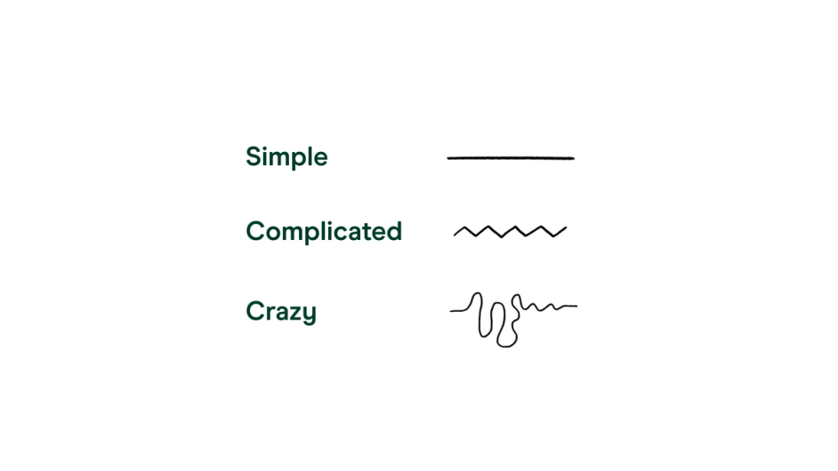
A lot of the work that was developed during this phase turned out to be experimental, however it was really useful since it captured all the ideas we had floating around. To give you an example: we already started playing with the idea of how to represent life in a minimalistic way and came up with the “lines of life”. Life can be simple, complicated and crazy.
Step 1: Immersion
During this phase, DesignStudio visited our offices to gain a deeper understanding of our company, culture, vision and goals.
They compiled all the information and presented a summary of their findings. Many of their discoveries were not new to us but it was exciting to see them framed in a different way. Also, their perspective allowed us to see ourselves through a new lens.
Step 2: Strategy
For us, this was the most important part of the process. We experimented with many different positionings. This way, we learned a lot about ourselves and that we should finally turn outside what we always knew inside.
We are for the underdogs, those figuring life out. We aim for the rulebreakers and people who love their freedom: opt in, opt out, switch it, change it, make it yours. Embracing life with all its risks and thereby empowering our customers to live their lives to the fullest – that is the underlying concept of the new brand.

You can find out more about our vision in this article by our founder and CEO Christian.
Step 3: Visual Identity
When we started exploring how we could visually communicate our new identity, the biggest challenge was to find the right balance in all the visual elements. We needed to connect the concept of empowerment and accidents in a seamless and positive way. DesignStudio and our internal design team did a lot of explorations, narrowed it down, defined and redefined each concept.
The new visual identity of Getsafe reflects the concept of being forward-looking and positive, without underplaying negative events in your life.
Step 4: Brand Guidelines
After we aligned on a visual proposition, it was time to refine every single element of the new brand identity. The brand guidelines built the foundation for the implementation of the visual identity for our design team. During this stage, we focused on elevating the final design of the logo, typography, colours, and other aspects of our art direction.
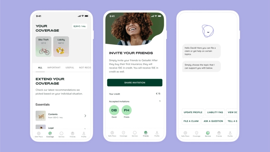
User experience is key at Getsafe. Our goal is and always will be to make our customers superfans of Getsafe. When it came to implementing the guidelines for our app and website, in many cases we opted for usability rather than design.
This focus fits Getsafe perfectly: our brand guidelines are designed to grow and change over time, just as the company has done since its foundation in 2015.
3. Introducing our new brand
When it comes to branding, there are always new challenges. As we started to implement the brand, we saw more areas where our brand could keep evolving. We are excited to implement all these new changes for our members in the future. Let me walk you through my favourite elements of our new identity.
Concept
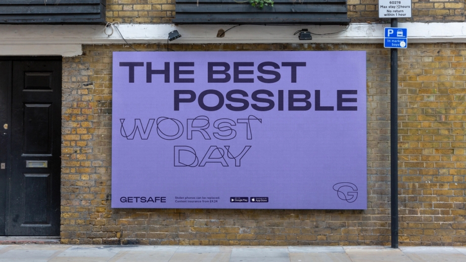
Life happens! Our approach is to accept accidents and embrace them as part of day-to-day life. Simple and to the point, with our visual identity concept we want to reflect everyday situations that can go wrong, but should not faze you. This concept applies to every single piece of the new brand.
Logo

Our logo is derived from the moment you bounce back from adversity. It has a confident, playful and optimistic spirit. We intentionally included an “accident” in the logo itself by adding a dent to our G symbol.
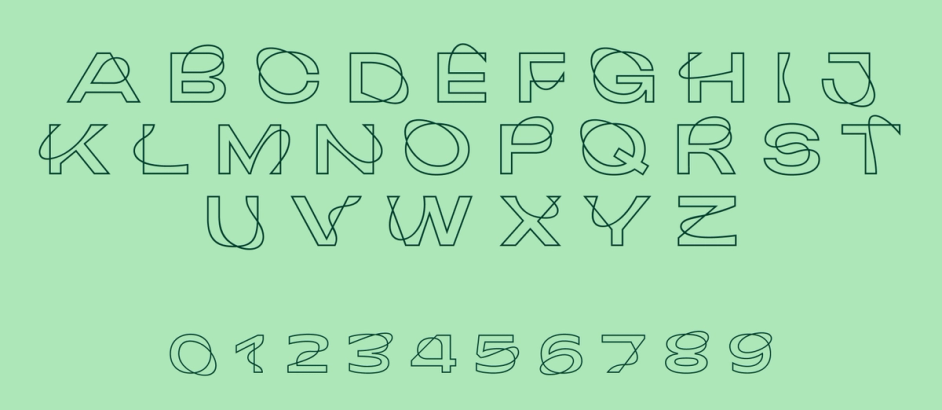
Typography
When it comes to typography, we expanded from one font to three different fonts. We now use Modern Era, Adieu and an outlined version of it, our custom font Accidental Adieu.
Colours
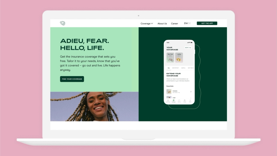
Our colour palette represents the contrast between the before and after the “accidental” moment. We decided to use green as our primary colour. Each colour has a positive and an enriching variation and this contrast is used across our colour palette.
3D Elements
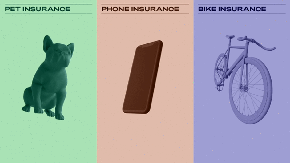
Every brand needs to create an extra intangible layer of differentiation. With our 3D elements we are expanding the visualisation of the Getsafe universe.
4. Learnings and outlook
Finding our strategic proposition and behaviours was the key to generating alignment across the organisation. What was crucial from our point of view is the external perspective: going through this process together with DesignStudio really helped us shape and sharpen ourselves. In workshop sessions and playbacks, new values were created and all our projects started to fall into the new brand strategy. Everything came together.
I strongly believe that the biggest win through the rebranding process came from allowing ourselves as an organisation, to gain an ever deeper understanding of who we actually are, and at that same time we gained a great new look that brings consistency.
Overall, we placed a lot of emphasis and effort on integrating the new brand into our different touchpoints and we are really excited to see how our customers will benefit and identify with Getsafe in the future.
We truly believe that an important part of life is taking risks. This is where we step in. We don’t promise life to be less risky, but we can make sure that we’ll be there for our customers at every step of their way.
Stay safe!
Nico
You might also like: